
SEATTLE RECRUITING BATTALION
While working for the Seattle Recruiting Battalion, I used my graphic design skills to create the Battalion logo and develop professional branding materials that supported the unit’s mission and identity. I also cleaned up and standardized company logos by creating a consistent template, improving cohesion, readability, and overall visual quality across the Battalion. Additionally, I designed logos for recruiting stations to help strengthen local identity while maintaining a unified and professional Battalion-wide brand.
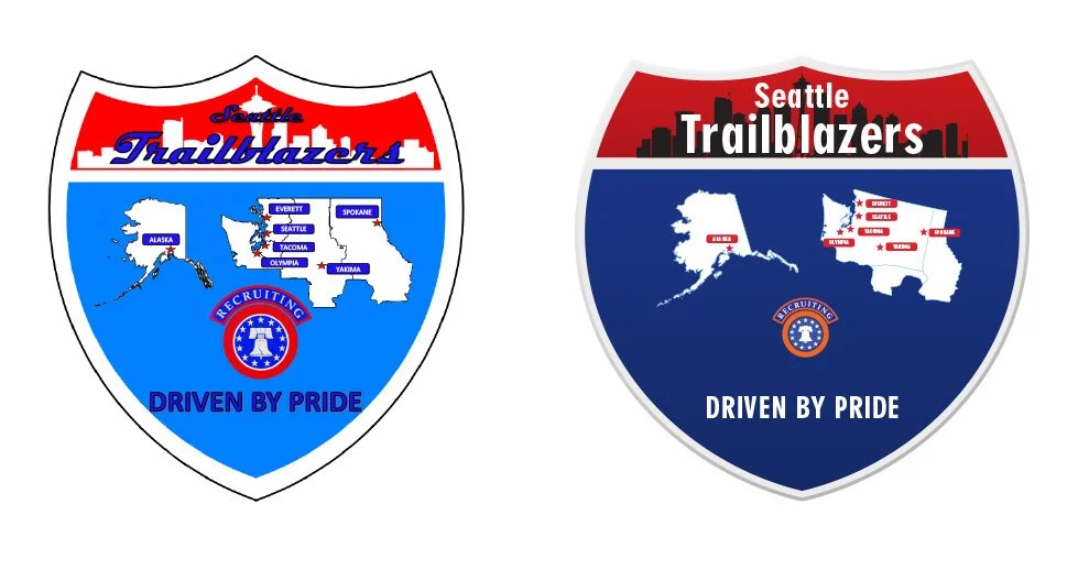
The logo was updated into a cleaner, more modern design inspired by an Interstate sign to reflect the Recruiting Stations along the I-5 corridor. The revised version keeps the Seattle Trailblazers identity, recruiting theme, map elements, and “Driven by Pride” motto while improving readability, contrast, and overall visual impact.
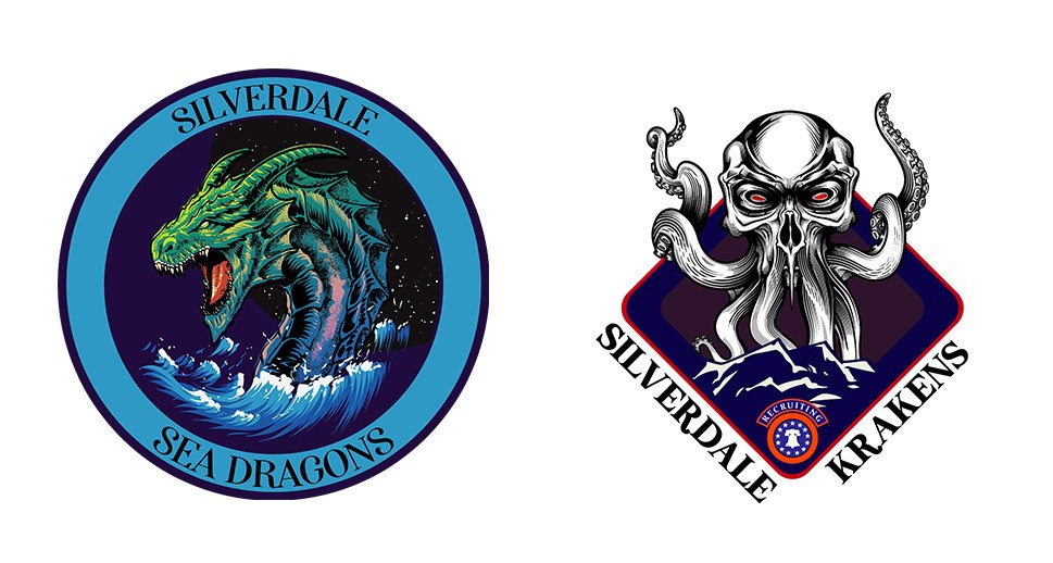
The Silverdale logos show two bold fantasy-themed directions: the left uses a sea dragon with ocean action, while the right uses a kraken-inspired skull design with a darker, more aggressive emblem style.
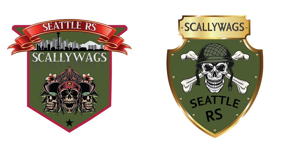
These two logo designs were created around the customer’s request for a strong pirate-themed identity while keeping the Seattle Recruiting Station Scallywags name recognizable. The first design uses a bold banner, Seattle skyline, ship, and multiple pirate skulls for a detailed and aggressive look, while the second design simplifies the concept into a clean shield-style emblem with a skull, crossed bones, helmet, and gold accents.
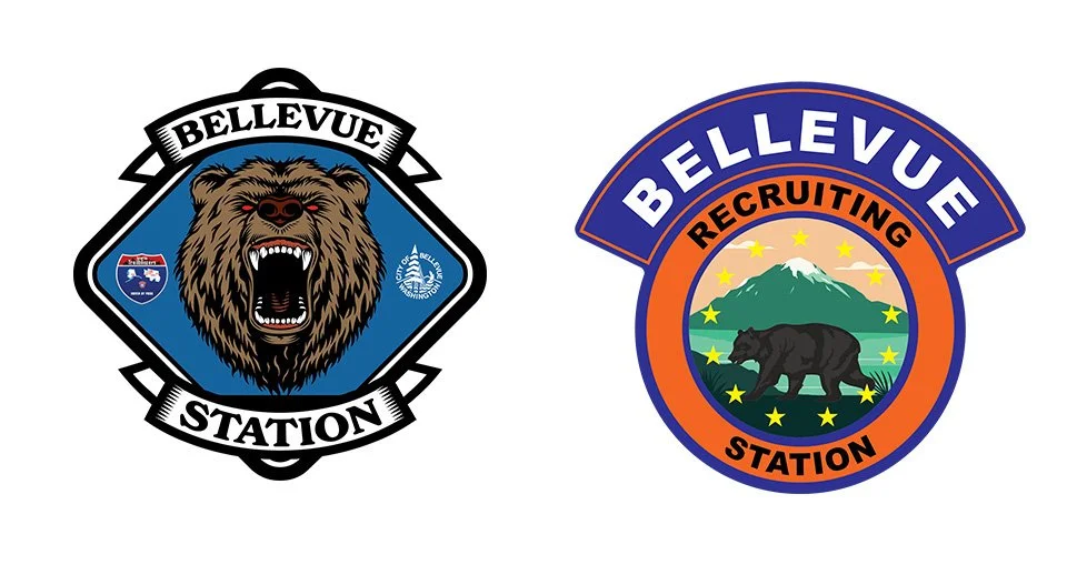
These two Bellevue Station logos present different creative directions for the same recruiting identity. The left logo has a bold, aggressive feel with a roaring bear and strong badge-style layout, while the right logo uses a cleaner circular design with a mountain, bear, stars, and bright colors for a more polished official look. Both designs represent Bellevue with strength, regional pride, and a clear recruiting station theme.
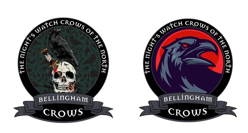
These two Bellingham Crows logos show two different approaches to the same dark, bold team identity. The left design has a detailed gothic style with the crow, skull, and textured background, giving it a dramatic and intimidating look. The right design modernizes the concept with a cleaner crow illustration, stronger color contrast, and a more polished emblem layout while keeping the “Night’s Watch Crows of the North” theme.
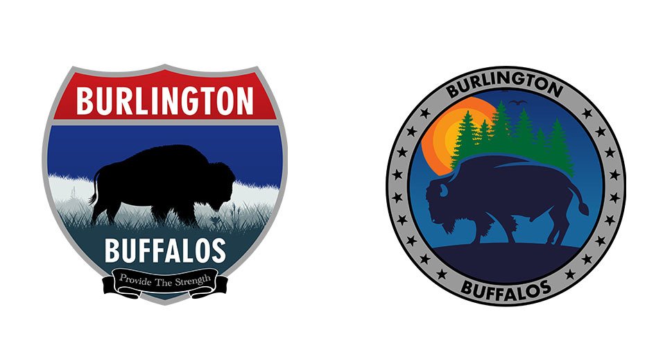
The Burlington Buffalos logos show two strong design styles: the left is a bold shield design with a classic buffalo silhouette, while the right is a cleaner circular emblem with a scenic background and modern buffalo artwork.